CHASE SAPPHIRE
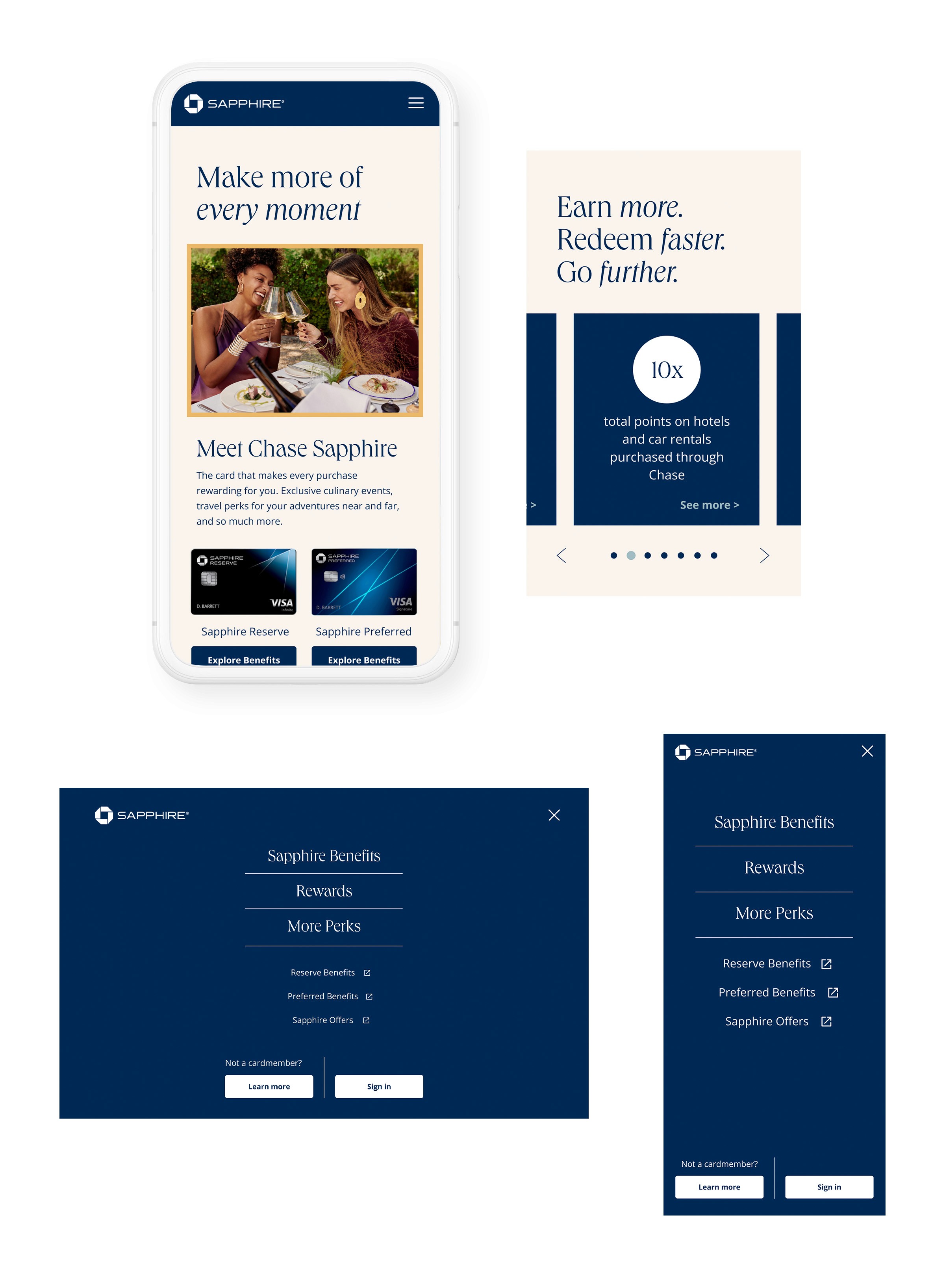
I was tapped for UX and Art Direction to apply new visual branding to four landing pages for Chase Sapphire Preferred and Reserve.
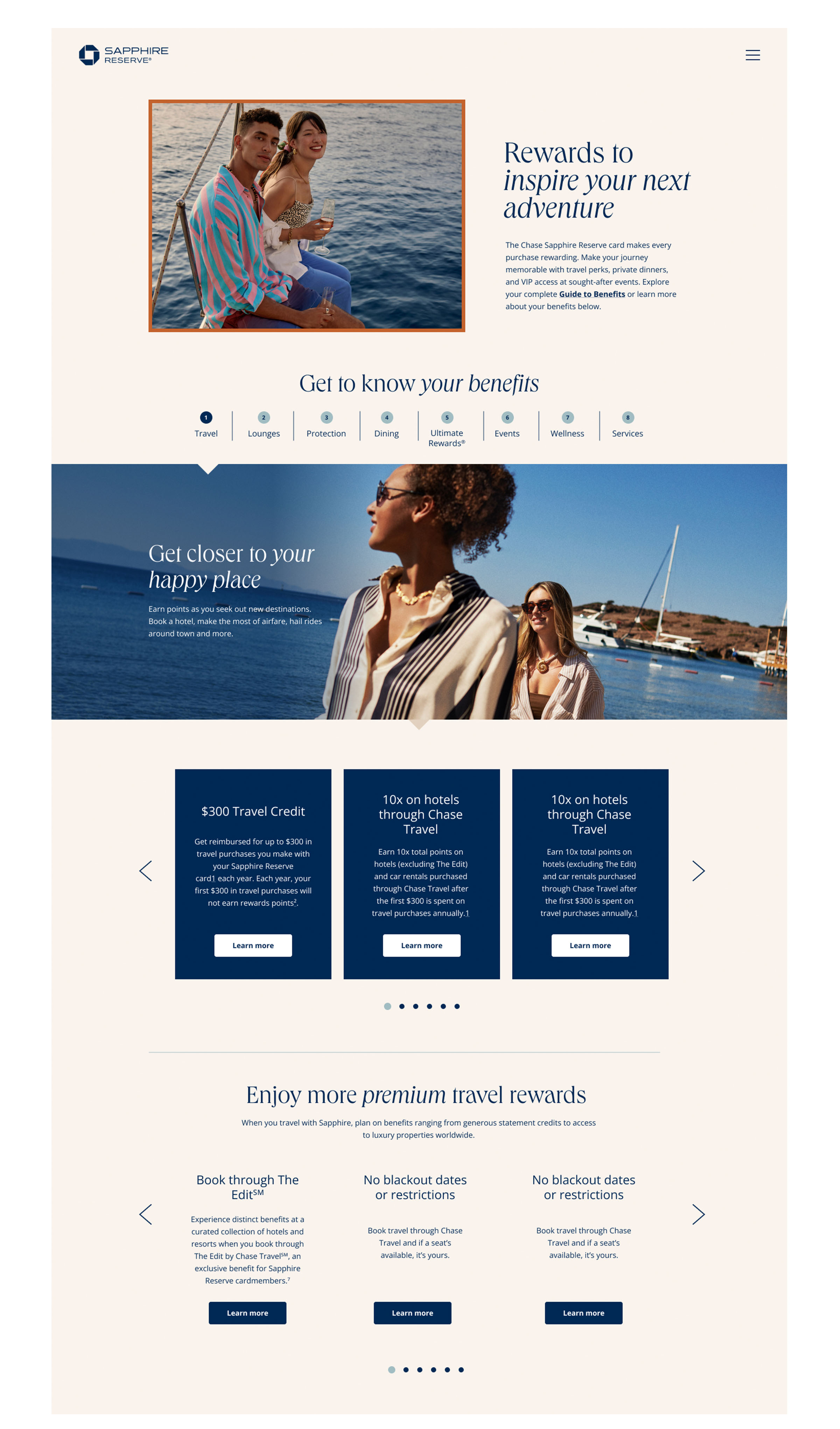
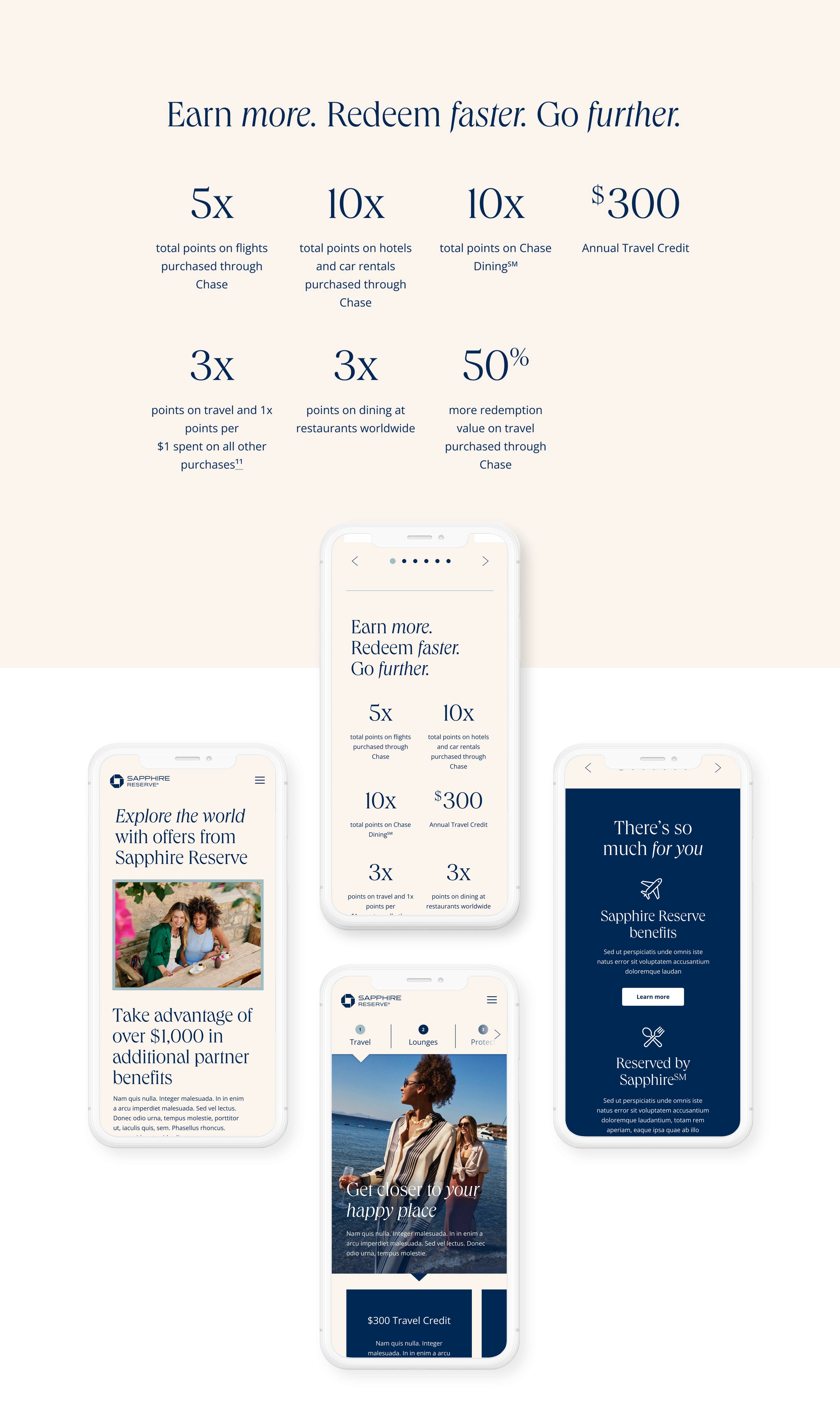
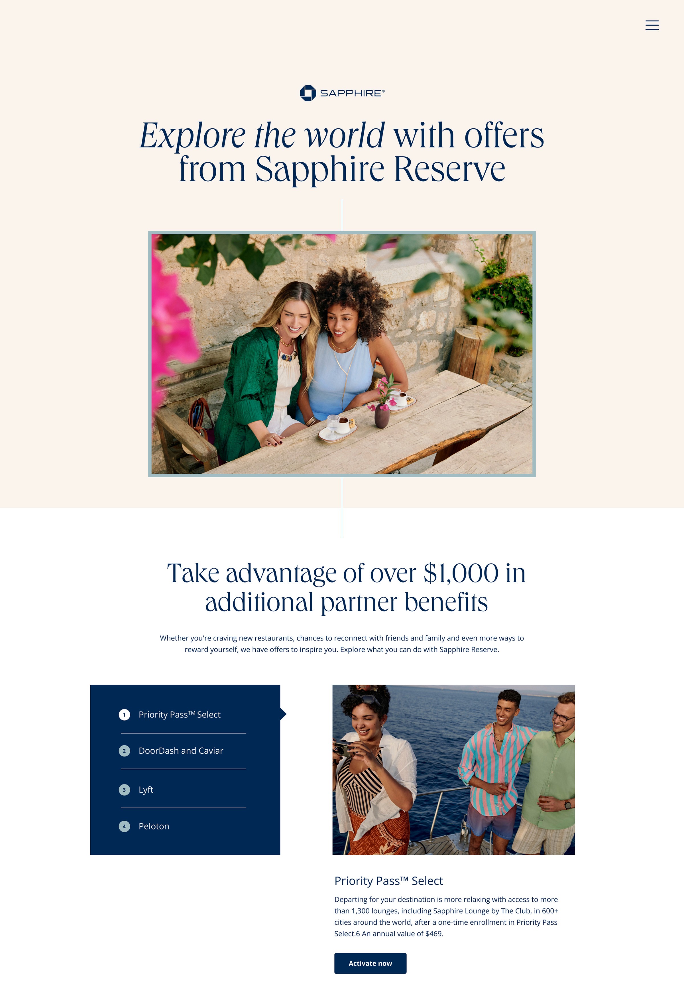
Armed with UX testing and heat map data, I made updates to hierarchy and content layout. I pushed for a more editorial layout and aesthetic to tell the story and benefits of Chase Sapphire in a way that is quick and easy to digest while conveying the prestige of Chase Sapphire Reserve.
Previous navigation only took users out of the page, most often to a login screen, which was a confusing experience. I reimagined the navigation to primarily anchor link within the page you are on, while clearly signifying when a link would take you to a new page.
A card like Chase Sapphire Reserve has a lot of benefits. That meant some sections were very rich in content. I worked to add hierarchy, reduce scroll length, and increase user interaction within sections.


