EL POLLO LOCO

As part of a new business pitch, I was tasked to quickly reimagine and streamline El Pollo Loco’s homepage and ordering experience using existing content and assets.
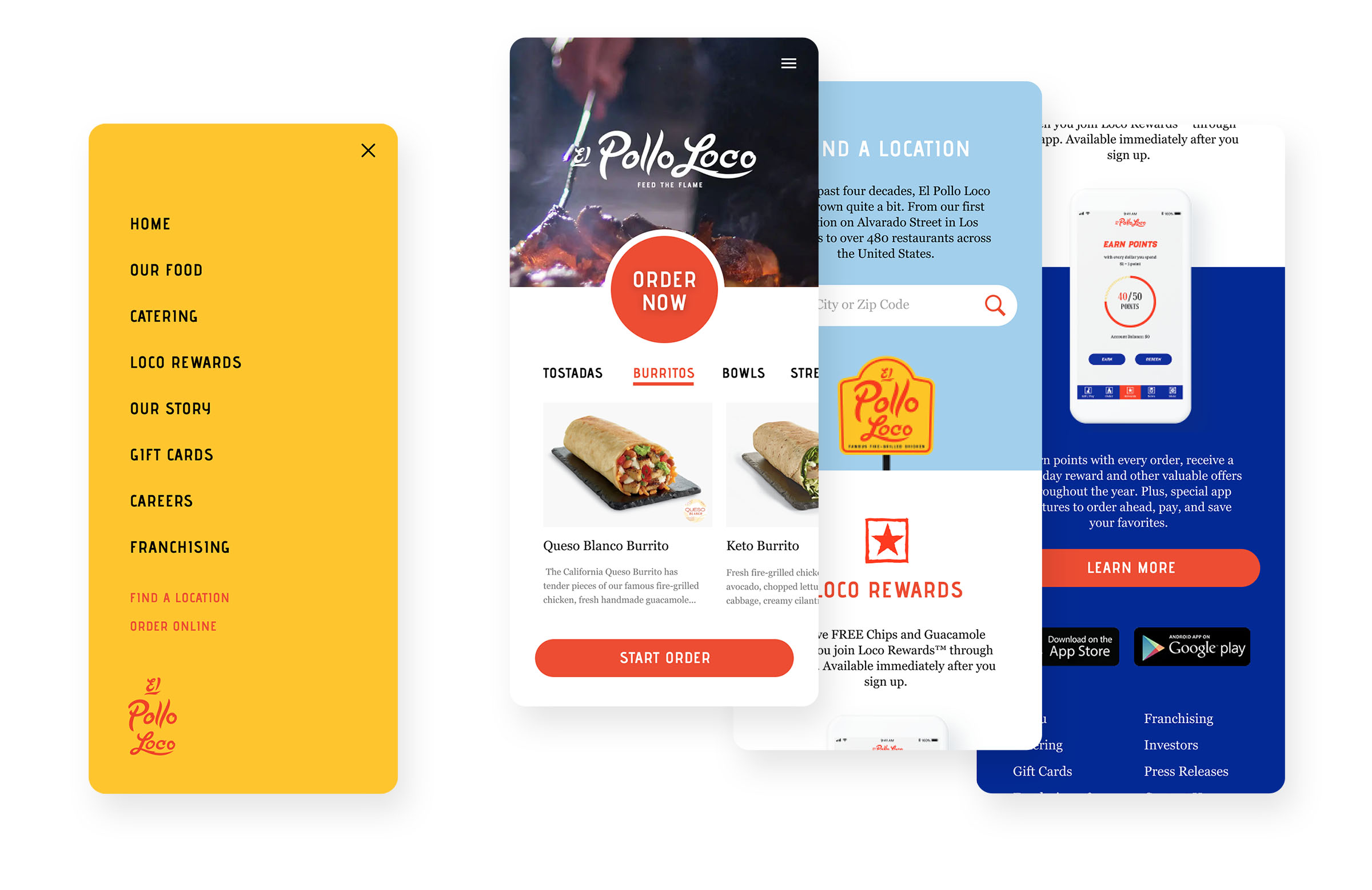
I centered the focus of the homepage around ordering while moving other content into the navigation menu. I also set out to contain most of what a user will be seeking on the site above the fold – In this case, the entirety of the menu and multiple CTAs pointing to online ordering.

I set out to create an ordering experience that felt ownable to El Pollo Loco while still retaining many of the interactions we have now come to expect from online ordering apps.

This was all completed within a one day turnaround.

𓃗

PREVIOUS
USER EXPERIENCE

PREVIOUS
USER EXPERIENCE

PREVIOUS
USER EXPERIENCE